The KSVT Brand
This page gives you an introduction into the KSVT Brand Style Guide, developed in 2022. Iif you're making materials for KSVT or partnering with our team, this should help you stay inline with our visual style!
If you're a journalist looking to get in touch, give us a holler at hello@ksvt.org!
Colors
The KSVT Colors
Below is the color pallete for KSVT. These colors should be used consistently across KSVT assets using the color codes below. They bring energy and vibrancy across all of KSVT’s visual assets and brand.
Text Contrast
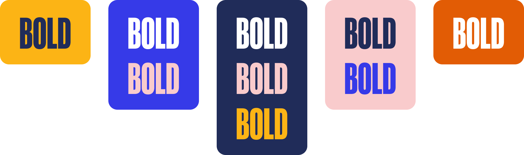
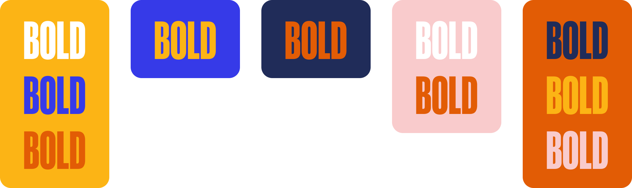
KSVT’s color palette has a wide variety of options in terms of combining colors, but some combinations provide less visual contrast than others, The below color combinations are organized by the amount of color contrast they provide, only use low contrast combinations in very large type sizes in decorative areas because they do no pass accessibility standards, and never use color combinations that are not listed below (eg blue on orange)
High Contrast
Low Contrast
Typography
KSVT uses 4 different typefaces and each one has a different role and usage.

Display Typeface
Paid font
Heading now is KSVT’s primary display typeface and should be used whenever possible in KSVT Assets. It is dynamic, bold, energetic and adds a lot of character to graphics and designs.It comes in 8 Widths and 8 Weights making it incredibly versatile. Any width or weight combination can be used but the most common ones are: 46, 73, 94

Secondary Typeface
Google font
Plus Jakarta Sans is KSVT’s secondary typeface used for longer text, and UI Elements. It is optimized for legibility and works at smaller sizes than Heading Now. This should be the go-to body font for all paragraphs in KSVT materials. It comes in 7 Weights with matching italics.

Print Typeface
Google font
EB Garamond is KSVT’s editorial typeface. It adds a more professional news flair to designs and can replace Plus Jakarta Sans as body text. In general this typeface should only be used in longform content from The New Edu and other longform content should use Plus Jakarta Sans

Display Alternate
Google font
Oswald is a backup display font that has similarities to Heading Now. It should only be used to replace Heading Now if the designer cannot access or use the primary typeface in a particular scenario (eg the design is just based in a google doc and Heading Now isn’t available there). Generally Oswald should only be displayed in All caps.
Logos
KSVT uses 4 different typefaces and each one has a different role and usage.
Download Logo Set
Primary Logo

Secondary Logo

Condensed Logo

Seal Logo

Icon Logo